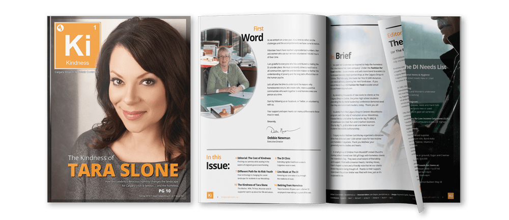
The Calgary Drop-In and Rehab Centre, a non-profit organization, embarked on a mission to redesign their quarterly newsletter – Kindness magazine, aligning it with a corporate rebranding initiative.
Quarterly Newsletter Redesign
Project Overview
Client Profile
Client: The Calgary Drop-In and Rehab Centre
Type: Internal Project
Role: Graphic Design, Print Design
Challenges & Objectives
Project Imperatives
The non-profit organization had a tight timeline of eight to ten weeks for us to complete the project. The newsletter redesign was a pivotal component of their rebranding strategy, requiring the creation of a modern visual design with consistent typography and page layouts.
Crafting the Solution
Project Approach
To ensure a cohesive and effective approach, bi-weekly project meetings were held with the brand director and marketing associate. This collaborative design process involved presenting project options for their feedback and approval over a span of six weeks.
Visual Renaissance
The initial phase of the project was dedicated to creating a fresh visual design for the newsletter. Branding standards encompassed consistent typography, colour palettes and page layouts. We initiated by crafting preliminary designs, which were presented to the team for feedback. After several iterations and refinements, the new visual design received their seal of approval.
Layout Precision
With the new visual design in place, the next step was to configure the print templates. We meticulously designed page layouts for the front cover, back cover, table of contents, standard articles and advertisements. These layouts were presented to the team for review, and after minor adjustments, the layouts received final approval.
Skills & Tools
The project was brought to life with the aid of the following skills and tools:
- Adobe InDesign
- Adobe PhotoShop
- Adobe Illustrator
Project Outcomes

Measuring Success
The project’s success was evaluated based on two key metrics: improved brand consistency and management. The newly introduced standardized brand elements in the visual design marked the initial steps towards enhancing brand consistency and more effective brand management for the organization. This not only refreshed their newsletter but also reinforced their corporate identity, aligning it with the broader rebranding strategy.